« Please help | Main | FYI »
November 09, 2004
Population Density Map
This particular one is also uses shades of purple to show which counties were just slightly Republican or Democrat.
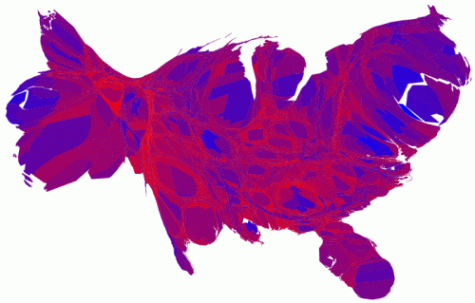
A much better picture for the Democrats than we were originally seeing in the county map.
Found at Pearly Gates.
Posted by Ensie at November 9, 2004 05:47 PM
Comments
Things look much brighter for the Democrats in Jackson Pollock's America.
Posted by: Mediocre Fred at November 10, 2004 02:50 PM
Well said, Fred.
Posted by: ensie at November 10, 2004 05:43 PM
Still an awful lot of red. And most of those purple counties are safely in the Republican column as well. (I think they used purple for anything
Posted by: Richard at November 10, 2004 07:59 PM
Damn thing cut me off...
...anything under 10%, so many aren't very close at all.)
Just wanted to kick you while you're down. :)
Posted by: Richard at November 10, 2004 08:01 PM
Thanks for thinking of me, Richard. ;)
Posted by: ensie at November 11, 2004 05:31 PM
Post a comment
Thanks for signing in, . Now you can comment. (sign out)
(If you haven't left a comment here before, you may need to be approved by the site owner before your comment will appear. Until then, it won't appear on the entry. Thanks for waiting.)